
The 60-30-10 colour rule: A simple way to improve your marketing design

Colour is one of the first things people notice about your marketing. Get it wrong, and your document looks busy or inconsistent. Even if the content is strong.
The 60-30-10 rule is one of the simplest tools I use to help clients get colour right.
Here's how it works.
What is the 60-30-10 rule?
It's a guideline for distributing colour across a design using three proportions.
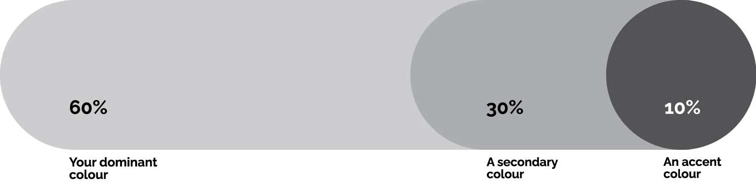
The idea is that one colour leads, one supports and one highlights. That's it.
The numbers don't need to be exact. What matters is the principle: clear hierarchy stops your design from looking like everything is competing for attention.
Why it works
When too many colours share equal weight on a page, the eye doesn't know where to go. It jumps around. Nothing stands out. The reader feels the chaos even if they can't name it.
The 60-30-10 rule gives your design a clear order. The dominant colour sets the tone. The secondary creates structure. The accent directs the eye to the most important element such as a call to action, a key stat or a headline.
This is why a well-designed button works. One bold colour surrounded by calm gets noticed and gets clicked.
How to choose your three colours
Your 60% colour should be neutral enough to cover large areas without becoming overwhelming. Think navy, warm grey, charcoal, cream or white. In most marketing documents this will be your background or a dominant brand colour.
Your 30% colour should complement the dominant. A lighter version of the same hue often works well, as does a neutral that sits naturally alongside your brand colours.
This is typically used for panels, sidebar boxes or secondary text elements.
Your 10% accent is where you can be bold. This is the colour for buttons, highlights, pull quotes or any element you want the reader to notice first. Used sparingly, it does a lot of work.
Where I see this go wrong
The most common mistake I see in marketing documents is using brand colours equally across every page.
Just because a colour is in your brand palette doesn't mean it should appear at the same weight as everything else.
Pick a lead colour. Let the others support it.
The second mistake is using the accent colour too often.
Once it appears everywhere, it stops being an accent. It just becomes noise.
A quick check for your next document
Before you finalise any marketing piece, ask yourself:
Is one colour clearly doing most of the work?
Does the secondary colour support rather than compete?
Is the accent used only where you want attention?
If the answer to all three is yes, your colour is working.
Good colour doesn't need to be complicated. It just needs a clear hierarchy. And the 60-30-10 rule is the simplest way to get there.