
The designer's secret for better marketing engagement

Did you know that when scanning content your eyes naturally follow specific paths?
These patterns offer a secret weapon for creating more engaging content.
So what are these patterns? And how can you use them to improve your marketing material?
Well the two most common patterns are the Z shape and the F shape.
Let's explore what these patterns are and how you can use them to design better marketing collateral.
The Z pattern
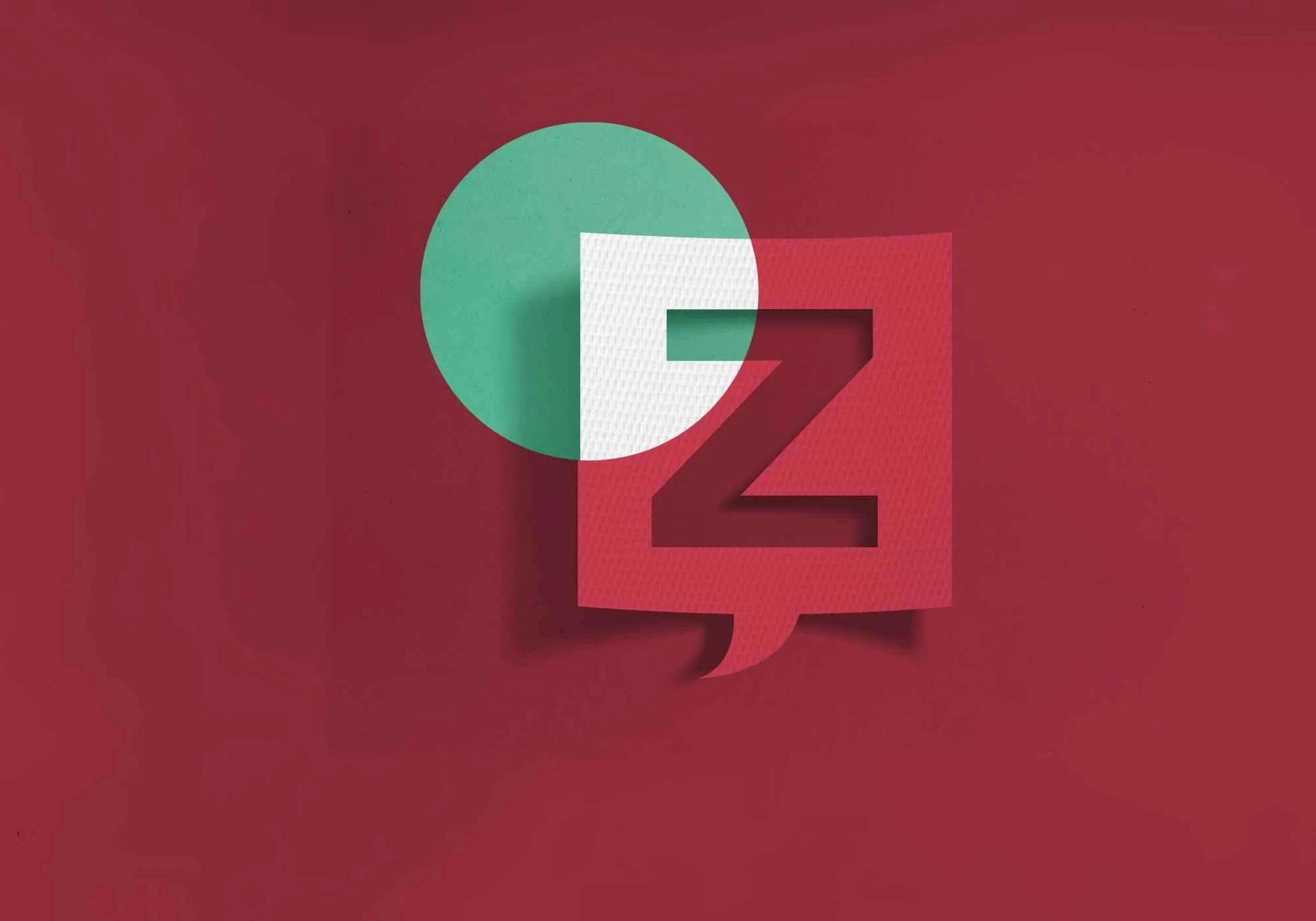
Imagine drawing a big letter "Z" on a blank page. Your eyes start at the top left, move to the top right, then down to the bottom left, and finally to the bottom right.
This is the Z shape pattern.
And it's used because it's how our eyes naturally move across a page.
Why use the Z pattern?
Easy to follow: Our eyes like to move in a straight line. The Z shape makes it easy to follow information from one point to the next.
Clear structure: By placing important information along the Z path, designers can ensure we see what's most important first, like headlines or key images.
Balanced design: The Z shape helps balance the design, making it look neat and organised.
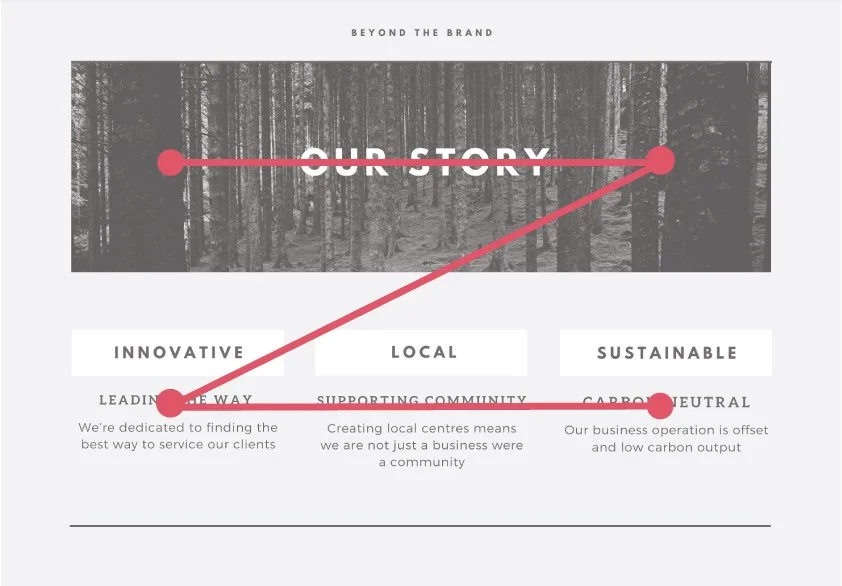
Tips for designing with the Z pattern
Best for landing or heading pages where there's less content
Design using the 'corners' of your page
For crucial content, avoid the centre of the page
Place any call-to-action at the bottom right of the Z
Design for skimming rather than reading
The F pattern
Now, imagine drawing a big letter "F" on a blank page. Your eyes start at the top left, move to the top right, back to the left, go down a little, read across again and then scan down the left side. This is the F shape pattern, which is also a very common reading pattern.
Why use the F pattern?
Natural reading flow: This pattern mimics how we read books—from left to right, and top to bottom. It feels natural and comfortable.
Highlight key points: Important information can be placed along the top and left sides of a layout, ensuring readers don't miss it.
Efficient skimming: We know that people no longer read content. We skim. The F shape allows content to be quickly scanned from the left side and top, catching the main points.
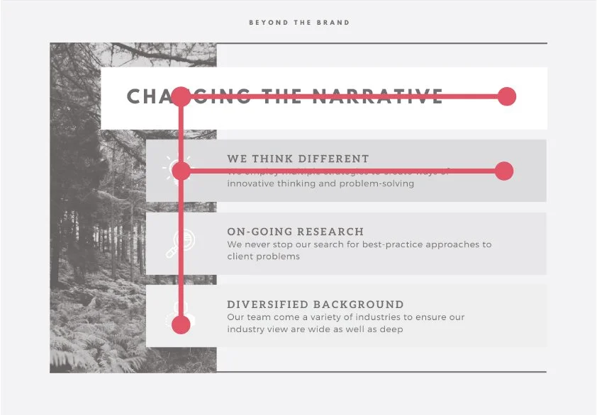
Tips for designing with the F pattern
Best for content-heavy pages
Anchor your reader's attention using subheads or bullet-points
Break-up text horizontally using white space
Highlight key content in the first line of text
Highlight key content in the first words of text lines
Why designing with these patterns improves engagement
Using the Z or F patterns when presenting content matches how we naturally move our eyes.
Marketing content becomes easier to read and digest when we use these patterns. Here are a few reasons why these patterns are so effective:
Guiding attention: By placing critical information where our eyes are likely to look first, these patterns help guide our attention.
Improving focus: When the layout follows a predictable path, it's easier to stay focused and find what we're looking for.
Enhancing experience: A well-designed page that harnesses these patterns feels more natural and less frustrating to read.
The takeaway
Harnessing the Z or F patterns in design makes marketing material easier to read and more engaging for the audience. These patterns naturally follow how our eyes move, guiding us from the most important content to the least.
Whether it's a presentation or a professional website, knowing about the Z and F shape patterns can help make your designs more effective.
Next time you read something online, see if you can spot these patterns in action.