
Why your presentation design is missing the point

If your presentations are creating confusion instead of value, you're probably guilty of one or more of the following.
There’s too much text
The text repeats what the presenter is saying
The visuals are confusing
Too many colours
Images are boring
And there’s not enough white/ neutral space.
So, how can you ensure your presentation is engaging while also representing your brand in the best light possible?
In this article, I’ll go over what you need to nail your next presentation and keep your audience engaged.
Brand ambitions
If your slides appear disjointed and lack consistency or brand style, you’ll lose your audience at record speed.
Slides should delight and engage the viewer while giving them a sense of comfort through a uniform design theme.
Consider your brand style and create a set of page types that can be used for different content.
Try to cap your presentation design to four or five page types.
Information overwhelm

The most common mistake in presentation design is cramming too much information into one slide.
The presentation content should be like the water runner for the speaker, not an opposition player.
I know you may have a lot to communicate. However, keep deep content to a handout or a digital PDF so the user can read it later.
Keep content simple and easy to digest using white or neutral space to avoid overwhelming the audience.
Typography time

Type choices can make or break your presentation design.
Consider typeface sizes and make sure to test them for legibility.
Use a contrasting typeface for emphasis.
But don’t overdo the amount of type styles; stick to two to be safe.
You can access free Google Fonts here.
Colour your world

Colour has a direct response to our emotions.
Harmonious colours (eg green and blue) convey a calm and secure response.
Contrasting colours (eg red and blue) create a sense of dynamism and energy.
Too many colours in your presentation design will overwhelm your audience and detract from the core message.
Be sure your colour choice is representing your brand and message.
Canva offers a great colour palette tool.
Hierarchy hero

The lack of visual hierarchy is confusing and leads to disinterest.
Visual weight guides the viewer through the page information from most imortant to least.
Consider the most important content for each page give that content the greatest emphasis through scale, colour or positioning.
If you're keen to understand more read this article over at The Noun Project.
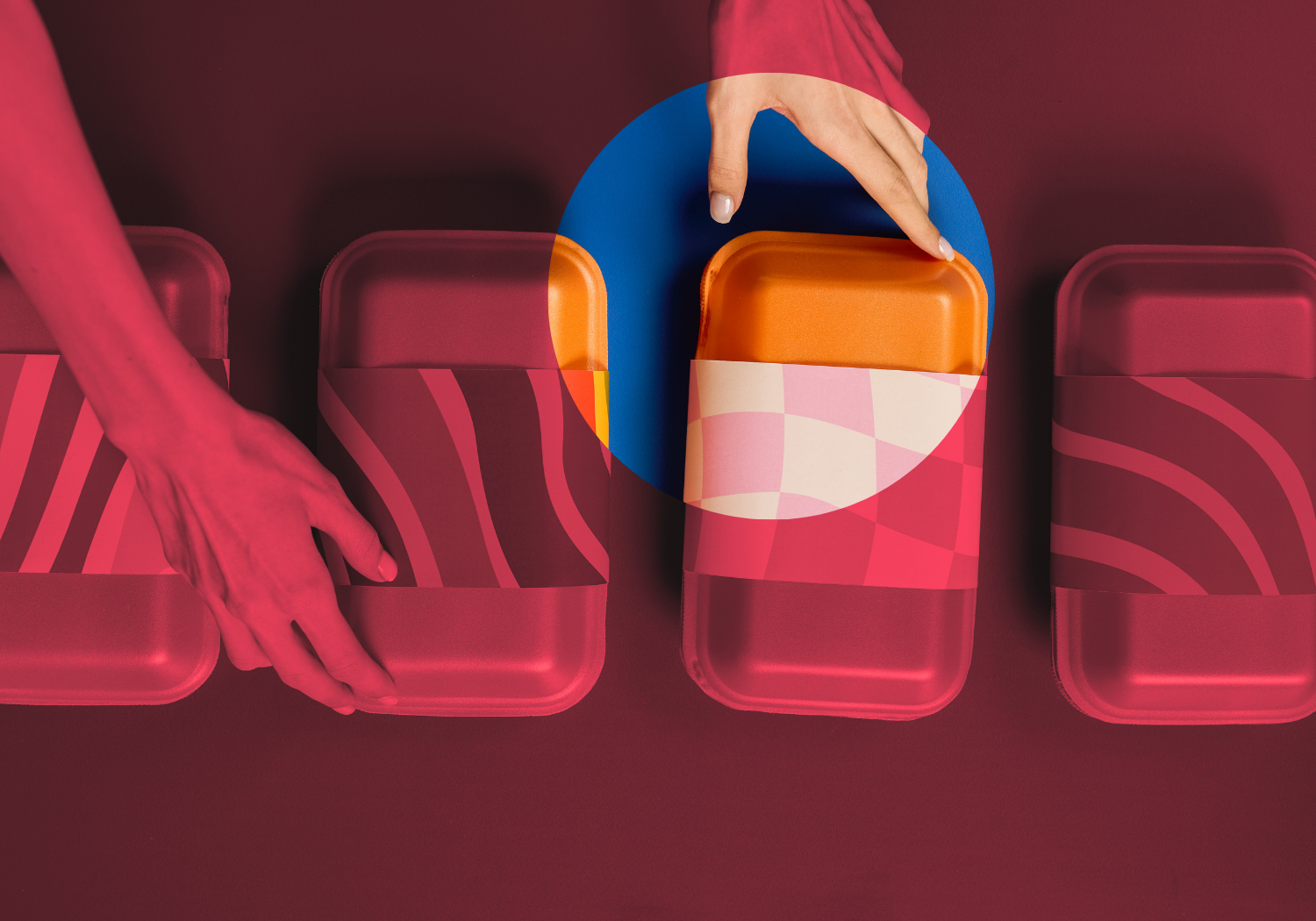
Images, visuals and icons oh my
Images and visuals should tell a story.
And finding the perfect image is probably THE most time-consuming part of any design job.
But it's also key to an engaging presentation design.
Use photos that are abstract enough to be intriguing while also staying related to the topic.
Consider an aerial photo of a cityscape taken from directly above instead of an angled perspective.
Icons and other visuals can create context and engagement in your presentation using a small page footprint.
Photo libraries such as Unsplash are a terrific place to find distinctive images.
The Noun Project offers a huge variety of icons.
Conclusion
Good design makes presentations not just bearable but compelling.
By considering each element on the page you’ll create a more engaging presentation and a better opportunity to win hearts and minds.
So go forth and take your presentation from uninspiring to remarkable.